FINANCE & TECHNOLOGY
Improving the application process for new bank accounts and credit cards

Project
At Scotiabank, you can apply for a new bank account or credit card online in as quickly as 8 minutes. I conducted a content audit of the application process — also called the customer onboarding journey — to see what new customers experience when they apply from a desktop computer and mobile device. The goal was to identify pain points, make recommendations that would improve the copy or design, and help develop a content strategy for future enhancements.
Approach
Content audits typically involve creating an inventory of every webpage under your brand. However, mobile experiences can be circular instead of linear. There are no page links. Users move through form fields, learn more webpages, third-party tools, and error messages — all of which could result in them abandoning their application.
I was interested in finding out how many applications were started and why users couldn’t finish them. From this, we could try to use words to knock down barriers to opening an account with the bank and try to increase the application success rate.
With the mobile and web designs on Figma, this was how I approached the audit:

1. Flagged content issues or opportunities
- Reviewed the copy for each screen
- Used colour coded sticky notes to indicate which screens could use improvement
- Flagged potential drop-off points
2. Identified themes
- Grouped the issues by common issues such as:
- Missing information
- Copy could be shortened or reworded
- Potential enhancement/optimization
3. Competitive analysis
- Reviewed what some of our competitors had done (hi!)
- Researched what non-banking mobile apps were doing
4. Shared findings and recommendations
- Presented the insights, rationale, possible solutions and ideas to stakeholders
- Highlighted quick wins that may help users get through the application
Results
The content audit shed light on strategic initiatives that could make the application process for Scotiabank bank accounts and credit cards more seamless and intuitive. This included:
- Opportunities to rephrase instructions and error messages
- Directing users to the right support channels for help (thereby reducing calls or visits to the branch)
- Simplifying forms to make it easier to input information
- Building trust through transparency
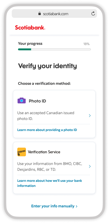
Example of a quick win
I recommended adding “and selfie” to a screen where users choose what to provide to verify their identity. This requirement was missing and this fix would explain why the bank was suddenly asking you to take a picture of yourself.
Verifying your identity with a selfie